brand identity | 2024
KNEADERY BRAND IDENTITY & branded space
Kneadery is a bakery brand that focuses on creating fresh bread and pasta daily and sourcing ingredients locally.
Created in my identity design class, this project focused not only on branding but also on creating the space in which it lives.
identity marks

primary logo
This wordmark is the primary logo for the brand. The noodle-like typeface is meant to express the key components of the brand.

secondary logo
As a secondary logo, this icon is meant to be a spaghetti noodle formed into a croissant shape. I wanted to show the correlation between the brand's unique bread and pasta production.
This project aimed to express what the final brand identity would look like within an environmental context. This includes the interior and exterior of the establishment as well as traveling aspects like a food truck.

This bakery is meant to live in a city environment between other local shops and establishments. The colorful exterior offers outdoor seating for a casual mood.


Kneadery has a food truck that travels to local farmer markets weekly while offering all of its fresh products and dishes to go.
The interior of this bakery offers casual seating for customers to lounge and eat. There are bread and pasta carts around the area for people to browse and shop for fresh goods.

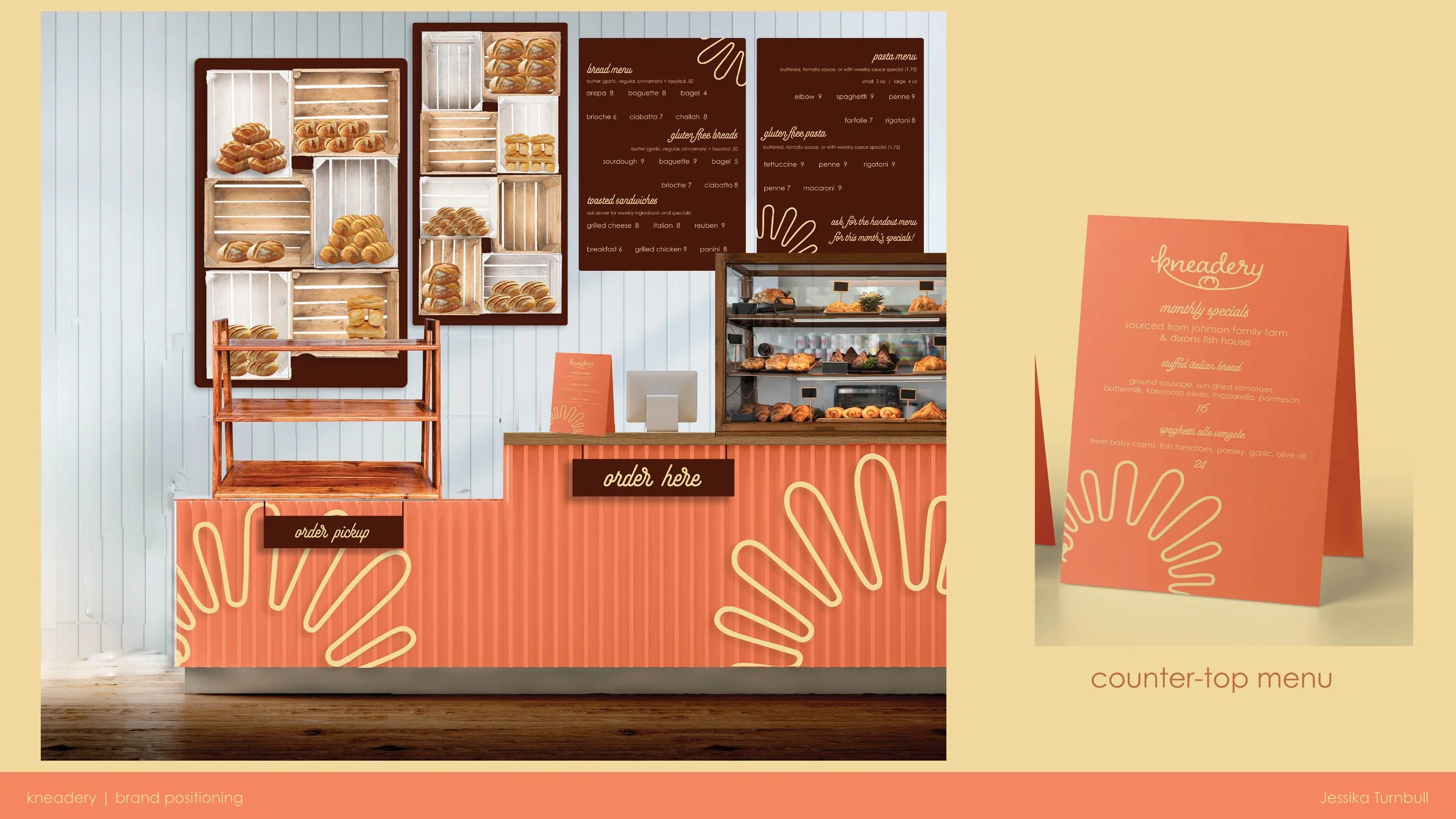
A cafe-type counter would stand at the front of the bakery where customers can order dishes from the weekly menu that are 100% fresh from the bakery and local sources.
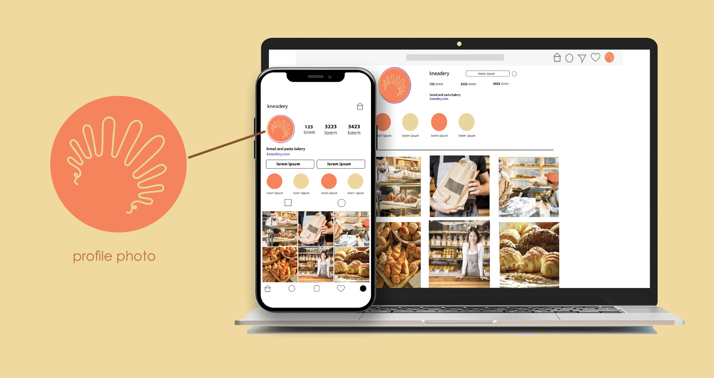
Social Media Presence
Social Media and Digital Formats
social media advertising | video design
Branding goes beyond the building itself- social media and marketing are just as important. This video represents the personality of the brand through their social media presence.
Physical brand Format
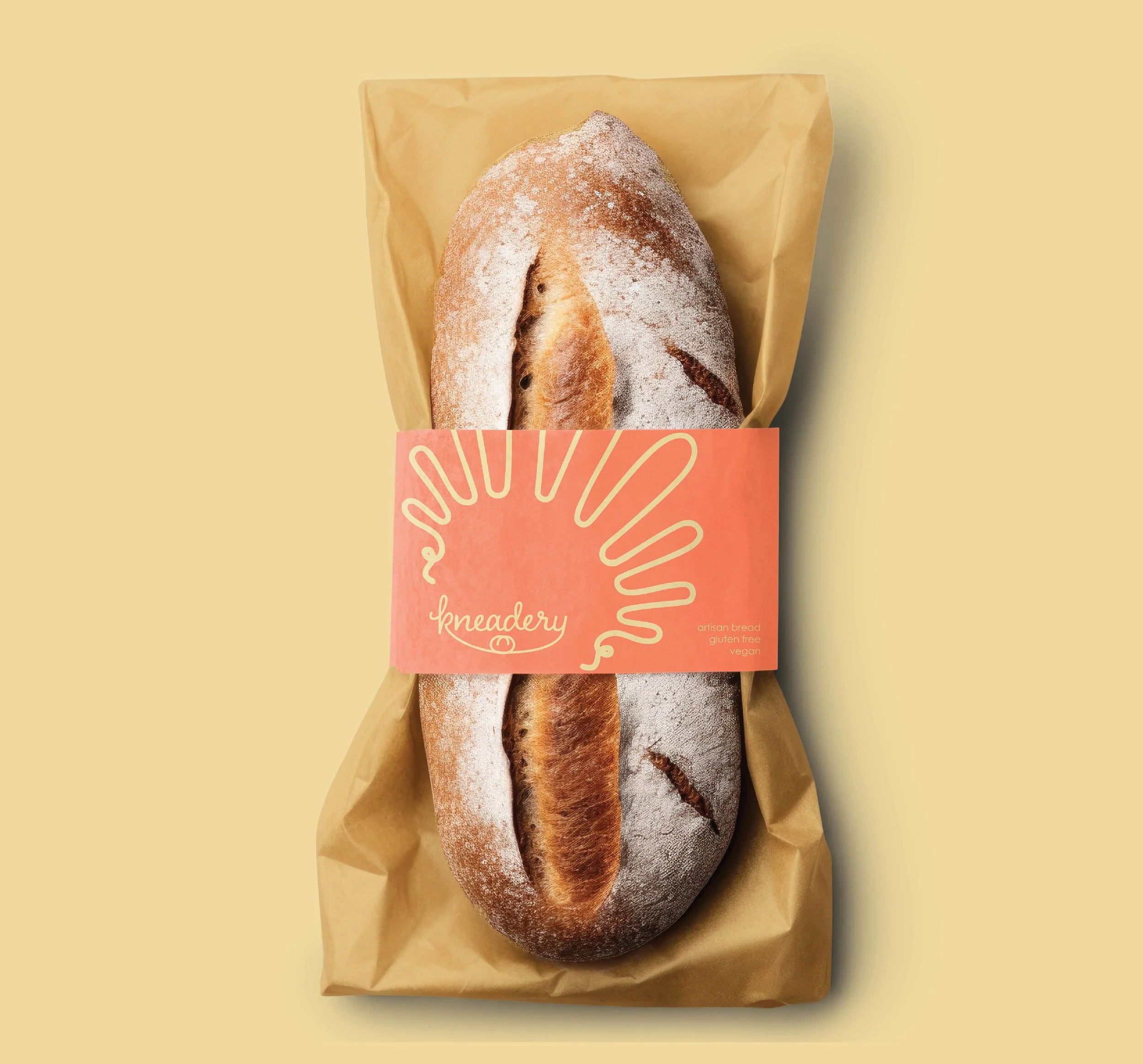
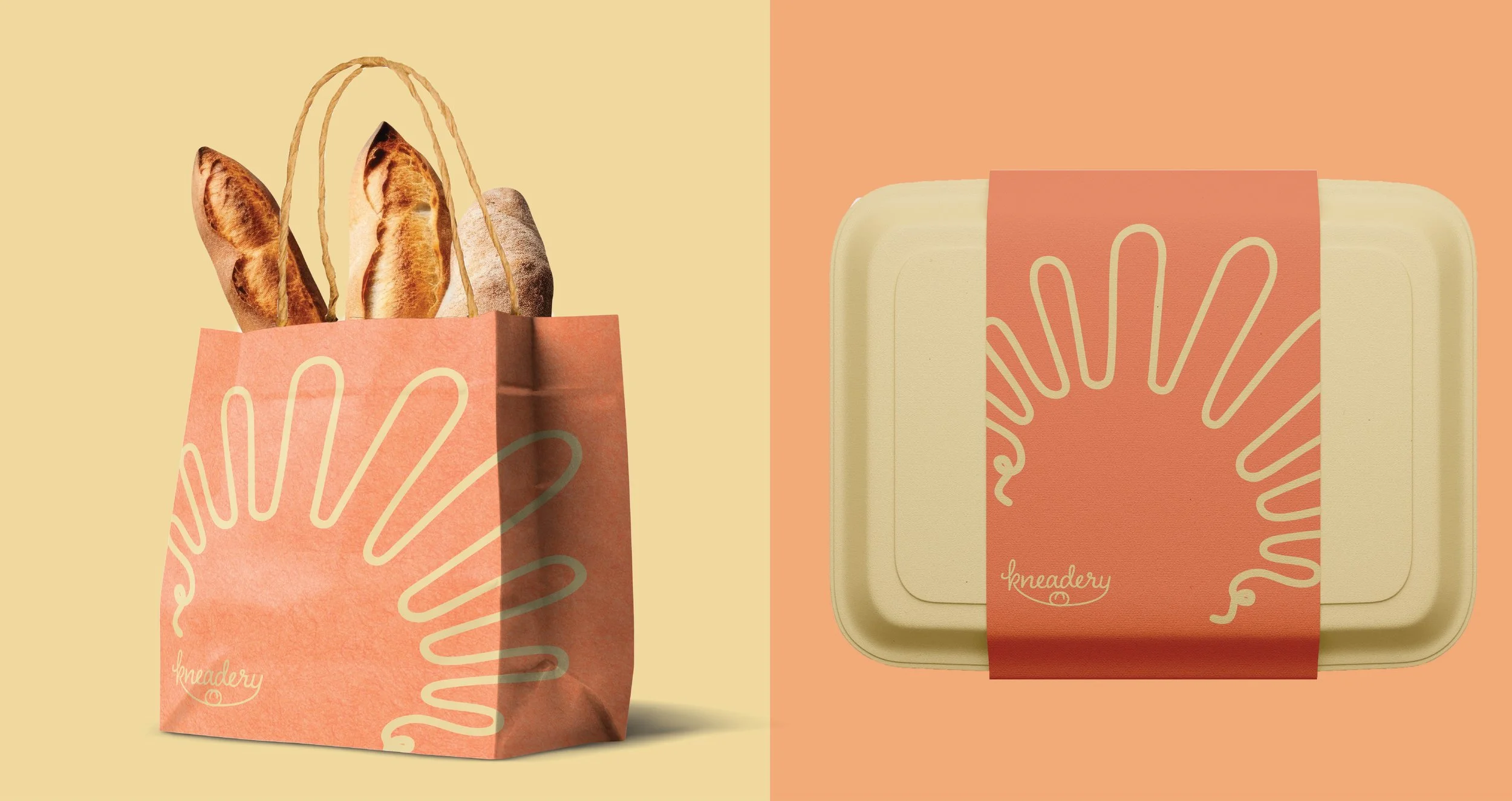
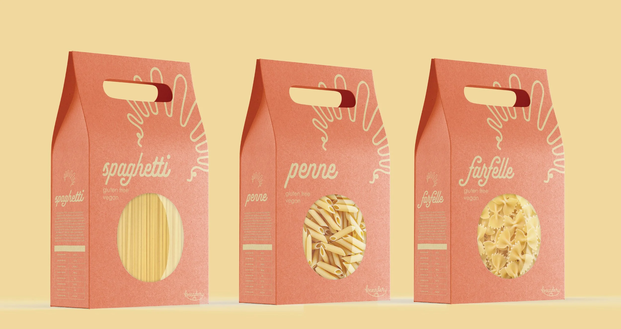
These are some items that are unique to the brand’s products. This focuses on the packaging aspects of the brand.
abbreviated brand standards